ARIMA THE BRANDARIMA
A new identity for the next chapter.2025 - 2026 · Rebranding · Campaign · Social Media
After four years of growing LADY BY ASH, the brand was ready to evolve.
What began as a womenswear label rooted in style, comfort, and sustainability was entering a new stage, opening itself to a wider audience across cultures, backgrounds, and genders.
The evolution called for more than a visual refresh. The brand needed an identity that could grow beyond its original chapter while preserving the intention and values that had shaped it from the beginning.
LADY BY ASH was becoming ARIMA.
TAV's role was to give that transition a new visual language: one mature enough for where the brand was going, while remaining connected to where it came from.

At the centre of ARIMA's identity is a story of growth and transformation.
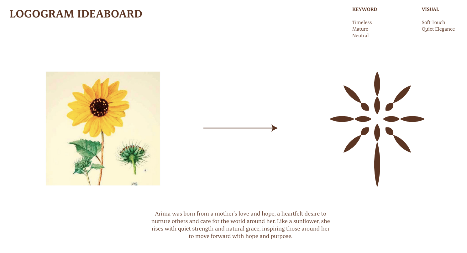
The logogram takes inspiration from the sunflower: a symbol connected to a mother's love, care, hope and quiet strength. Its form represents movement forward with purpose, giving the new identity an emotional connection to the values behind the brand.

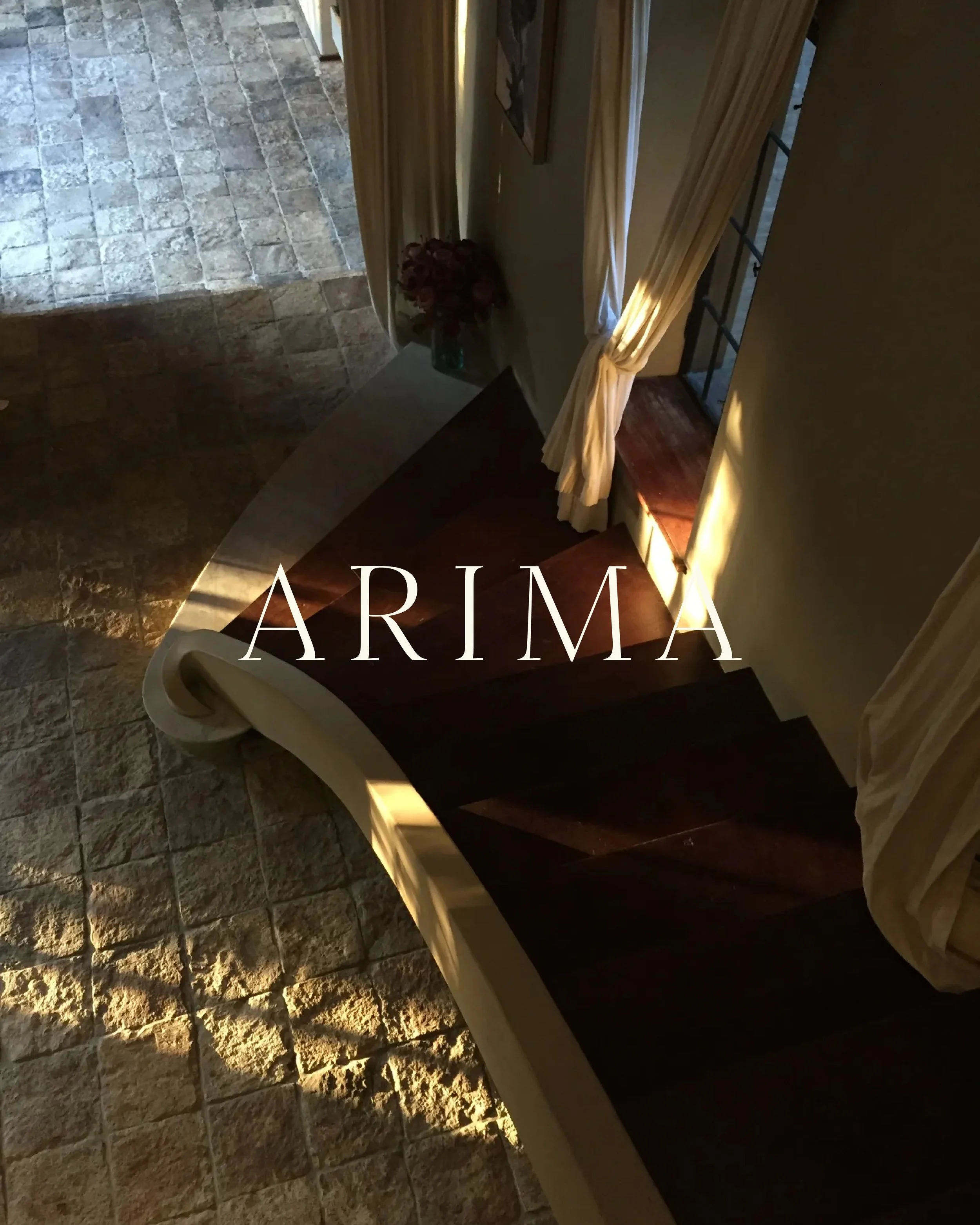
BECOMING ARIMA
The new ARIMA needed to feel evolved but never disconnected.
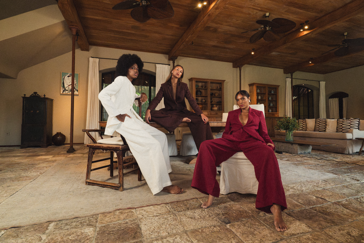
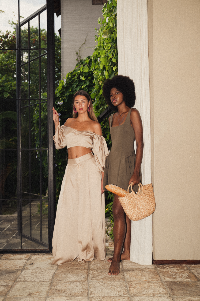
At its core remained the same belief in thoughtful fashion: well-crafted pieces, premium fabrics, sustainability, and effortless wearability. But its world was becoming broader, more inclusive, and increasingly self-assured.
TAV defined the new visual direction through a language of:
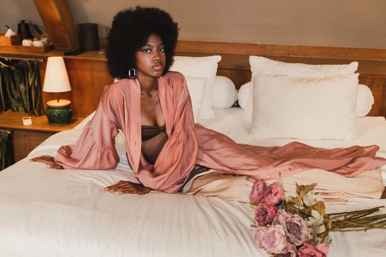
Timeless. Mature. Neutral. Soft Touch. Quiet Elegance.
Rather than creating an identity around overt luxury, ARIMA was shaped through restraint, allowing sophistication to emerge through softness, intention, and detail.
The rebrand became less about leaving LADY BY ASH behind and more about giving the brand space to become something larger.